Every image compressor gives you a choice you probably don't fully understand: lossy or lossless.
Pick lossy and your file gets dramatically smaller, but something gets thrown away permanently. Pick lossless and nothing gets thrown away, but the file stays bigger. One sounds risky. The other sounds safe. Neither name tells you which one you actually need.
The truth is that lossy compression is the right choice for most photos while lossless is the right choice for most graphics. The problem is that nobody explains why, or what "throwing data away" actually looks like in practice.
This guide gives you the visual, practical explanation. What each type does to your image. What the quality difference looks like at different settings. Which to pick for every common situation. And why the "lossy" option that sounds destructive is usually the smart one.
The core difference in one sentence each
Before any detail, here's the fundamental split.
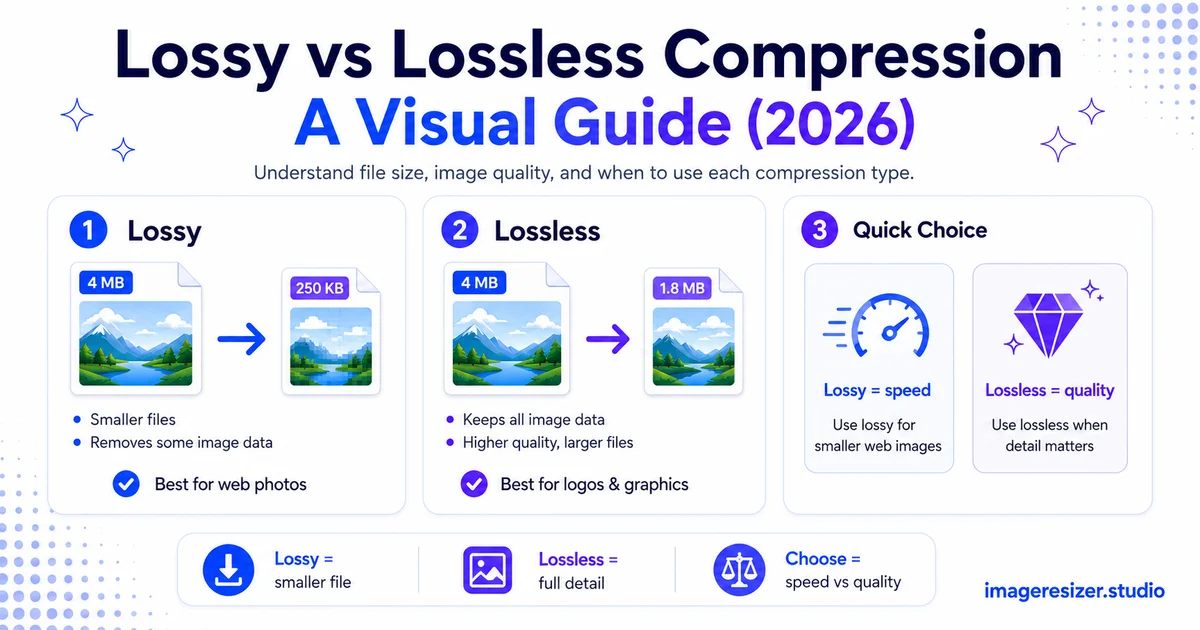
- Lossy compression makes the file smaller by permanently removing some image data your eye is unlikely to notice
- Lossless compression makes the file smaller by storing the same data more efficiently, without removing anything
Lossy = smaller files, some invisible quality loss. Lossless = larger files, zero quality loss. That's the entire tradeoff. Every decision about which to use flows from it.
How lossy compression actually works
Lossy compression is smart. It doesn't just randomly delete pixels. It analyzes your image, finds the data your human eye is least likely to notice and removes that first.
In a blue sky, for example, there might be thousands of slightly different shades of blue. Your eye can't tell the difference between shade #4,021 and shade #4,022. Lossy compression merges those near-identical colors into one, which stores the same visual result with far less data.
The same thing happens with fine texture details in busy areas. If a section of your photo has grass or gravel or fabric, the tiny variations are mostly invisible. Lossy compression simplifies those areas and keeps the parts your eye actually reads: edges, faces, contrast, color.
The quality slider
When you save a JPEG and see a quality slider from 0 to 100, that's the lossy compression control. At 100%, very little is removed and the file stays large. At 80%, a significant amount of invisible data is removed and the file shrinks dramatically. At 50%, you start to notice: soft edges, blocky patches in smooth gradients, fuzzy text.
The sweet spot for most photos is 75-85% quality. At that range, a trained eye comparing the original and the compressed version side by side might spot a difference. A normal viewer looking at the compressed version alone will not.
Lossy is permanent
The data removed by lossy compression is gone forever. You can't open a compressed JPEG and restore the original quality. That's why it's called lossy. If you save, edit, re-save and repeat, the quality degrades each time because each save removes more data.
This means you should always keep your original uncompressed file and only create lossy versions for specific uses (web upload, email, social). Never compress your only copy.
How lossless compression actually works
Lossless compression is like a zip file for your image. It finds patterns in the data and stores them more efficiently, but when the file is opened, the original is reconstructed perfectly. Every pixel comes back exactly as it was.
Imagine a row of 200 identical white pixels. Instead of storing "white, white, white..." 200 times, lossless compression stores "200 x white." The information is the same. The storage is smaller. Nothing is lost.
This works well for images with large areas of uniform color: logos, screenshots, diagrams, text. It works poorly for photographs, because photos have complex, varied color data that doesn't simplify much through pattern-finding.
Lossless is reversible
Because nothing is removed, you can save and re-save a lossless file as many times as you want with zero quality loss. This makes it ideal for working files, master copies and anything you plan to edit further.
Lossless files are larger
The tradeoff is size. A photo saved as lossless PNG is typically 3 to 5 times larger than the same photo as a well-compressed JPEG. For a single image that difference might not matter. For a website with hundreds of images, it adds up fast.
Visual comparison: lossy vs lossless
Seeing the difference makes it click faster than any description.
For a typical photo, lossy at 80% is 6 times smaller than lossless with no visible difference to normal viewers. That's why lossy is the default for the web and social.
When to use lossy compression
Lossy is the right choice far more often than most people expect. If your image is a photograph and your goal is to share it, display it on a screen or upload it somewhere, lossy wins.
Photos for websites
This is the single biggest use case. Every photo on a website should be lossy compressed to keep page speed fast. The full guide to compressing images for website speed covers the complete workflow, but the core rule is simple: lossy JPEG or WebP at 80-85% quality for every photograph.
Social media uploads
Social platforms compress your uploads again on their end anyway. Uploading a lossless file means the platform's compression does more damage to hit its size targets. Uploading a well-compressed lossy file at the right dimensions gives the platform less work to do. The complete social media image size cheat sheet shows the exact dimensions each platform needs so you can pair the right size with lossy compression for the best result.
Email attachments
Email clients cap attachment sizes at 25MB or less. Photos straight from your camera can be 8-15MB each. Lossy compression at 80% can shrink a photo from 10MB to 1MB with no visible difference, letting you send multiple images without hitting the limit.
Anywhere file size matters more than pixel perfection
Form uploads, document attachments, sharing via messaging apps. If the goal is getting a recognizable image from point A to point B efficiently, lossy does the job. And if you need to hit an exact file size target like 100KB, here's how to resize to a specific KB or MB, combining dimension changes with lossy compression.
Want to try both compression types on your own image? Use the free image compressor → for quick lossy compression, or try the custom compressor → to control the exact quality level, format and target file size. Compare the results side by side.
When to use lossless compression
Lossless is the right choice when every pixel matters and file size is secondary.
Logos, icons and brand assets
These are small, precise graphics where sharp edges and exact colors are essential. Lossy compression can blur edges and shift colors slightly. Lossless PNG or SVG keeps them perfect.
Screenshots with text
Text in screenshots needs to stay crisp and readable. Lossy compression can make text fuzzy around the edges, especially at small sizes. Lossless PNG preserves every letter perfectly.
Master files and archives
If you plan to edit an image again later, store it in a lossless format. TIFF and lossless WebP keep the full quality intact through unlimited re-opens and re-saves. Only create lossy versions when you're ready to publish or share.
Medical, scientific and technical images
Any image where data accuracy matters more than file size (X-rays, satellite images, technical diagrams) should stay lossless. Even invisible data loss could affect analysis.
What over-compression actually looks like
When lossy compression goes too far, the damage has specific, recognizable patterns.
Blocking (JPEG artifacts)
The most common artifact. JPEG divides the image into 8x8 pixel blocks. At low quality, those blocks become visible as a grid pattern, especially in smooth areas like skies, skin and backgrounds. If you see little squares, the quality is too low.
Banding
Smooth gradients (sunrise skies, studio portraits with soft lighting) break into visible steps instead of a smooth transition. Instead of a hundred shades of orange, you get five chunky stripes. This shows up below about 60% quality.
Mosquito noise
Dark fuzzy halos around sharp edges, especially where light and dark areas meet. Called mosquito noise because the artifacts look like a swarm of tiny dots buzzing around the edges of objects.
Color shifting
At very low quality, colors start to drift from the original. Skin tones look slightly off. Greens shift. Blues go purple at the edges. Subtle, but visible if you know the original colors.
All of these are avoidable by staying at 75-85% quality. They only appear when you push compression too hard, usually below 60%. If you see any of these, raise the quality setting.
Quick decision guide for common workflows
- Photo for Instagram or Facebook: lossy, 80-85% quality, JPEG or WebP
- Logo for a website: lossless PNG or SVG
- Screenshot of a UI for documentation: lossless PNG
- Product photo for an online store: lossy at 85%, WebP with JPEG fallback
- Photo for printing: TIFF (lossless) or JPEG at 95-100% (minimal loss)
- Working file you'll edit again: lossless always (TIFF, PSD, lossless WebP)
- App icon or favicon: lossless PNG at a small size
For social media specifically, the best results come from matching the right dimensions to the right compression. The image resizer for social media handles both dimension presets and compression in one step so you don't have to guess.
5 mistakes people make with compression
1. Using lossless PNG for every photo on a website
This is the most expensive mistake. A photo as PNG can be 5 times larger than the same photo as a well-compressed JPEG. Multiply that by every image on your site and you've added seconds to your load time for quality nobody can see.
2. Compressing an already-compressed JPEG again
Each lossy re-save loses more quality. If you open a JPEG, edit it then save it again as JPEG, the quality drops. Over several rounds this becomes visible. Always start from the original uncompressed file when creating a new lossy version.
3. Assuming lossless always means better
Lossless means no quality loss, which sounds better. But for photos on the web, the file size penalty isn't worth the invisible quality gain. Lossless is better for graphics. Lossy is better for photos. "Better" depends on what you're compressing.
4. Setting lossy quality too low to chase a file size
Dropping quality to 30% to hit a strict size limit wrecks the image. A better approach is to resize the dimensions down first, then compress. Two levers are always better than one.
5. Not keeping the original
Once you've created a lossy version, you can't recover the quality. Always keep the original uncompressed file. Create lossy versions for each specific use and treat them as disposable outputs.
Wrapping up
Lossy compression removes data you can't see to make files dramatically smaller. Lossless compression stores the same data more efficiently without removing anything. One gives you smaller files, the other gives you perfect files. The right choice depends on whether you're sharing a photo or preserving a graphic.
For photos: lossy at 80-85%. For logos, screenshots and graphics: lossless. For master files you'll edit again: always lossless. And no matter which you choose, keep the original, because lossy is a one-way door.
Now you know what the dropdown actually means. Pick the right one and your images come out small, sharp and exactly right for the job.